User interface design is at its best when you don’t notice that it’s there. Elements of the apps you use clearly communicate what they’re for. A user can easily find their way around. Universal symbols emerge, like the “hamburger” icon of stacked horizontal line that most people automatically know will launch a menu. And as the art and science of UX design has matured, it is quietly changing our lives by making them easier and more intuitive.
There are some exceptions. And if the internet and our apps were anything like toilets, things would be… messy.
Dual flush toilets are a great innovation for saving water. They use only the water needed to take care of the job since not all bathroom visits are created equal, giving the user the ability to selection option 1 or option 2. If you travel to Europe, these toilets are almost universal, since they tend to be ahead of us on such things. But they’re more and more common in the U.S. as well. And it’s chaos.
Good design users clues like symbolism or familiarity to make it easy for the user to know what to do in each use case. But dual flush toilets have no consistent UX design, making them impossible to understand.
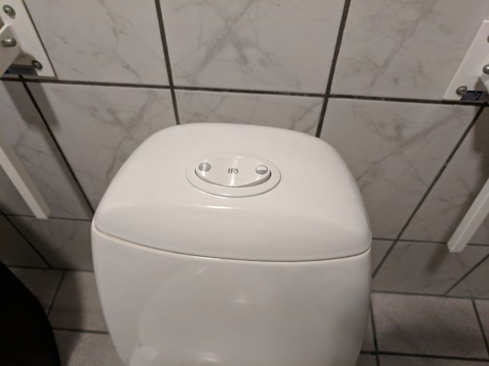
Consider this one. Does the bigger button symbolize the more common use case or the bigger job? Does the nesting mean that one adds to another? Do I work left to right to add more water, since that’s how we process progression?
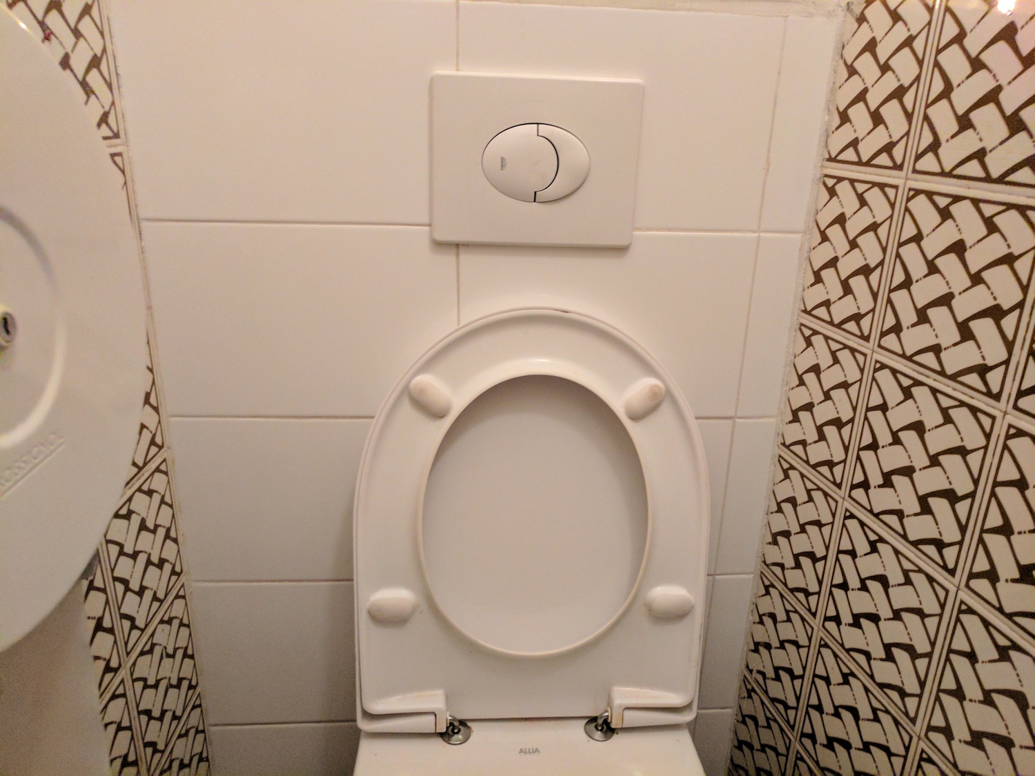
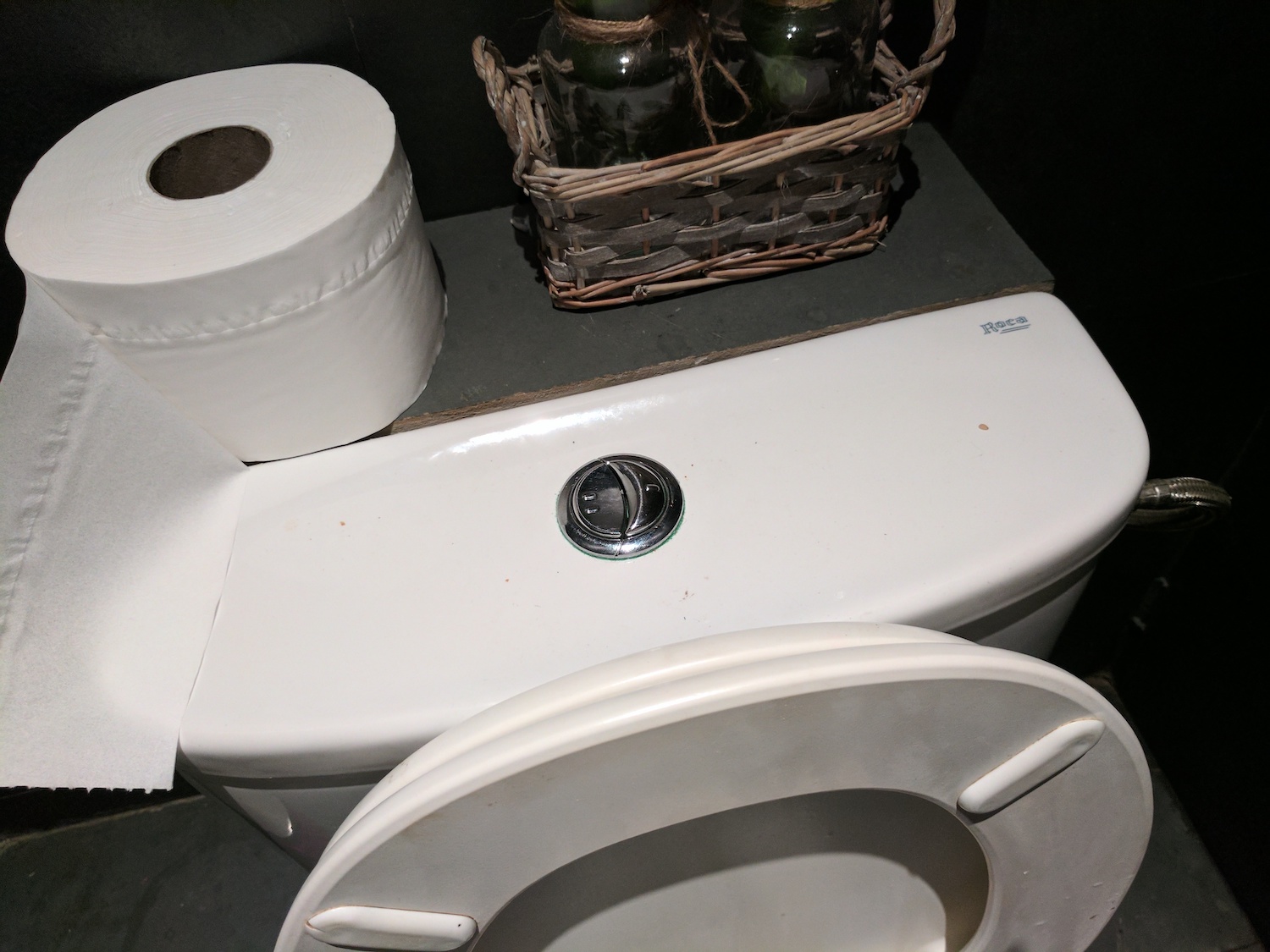
Next, we have the same questions and then some new ones. Is the option closer to the user the more common one, or the larger button?
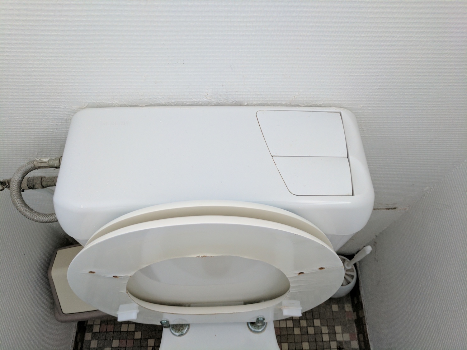
Other than trying to look like one of those Super Mario Bros. bad guys, I have no idea what to think of this.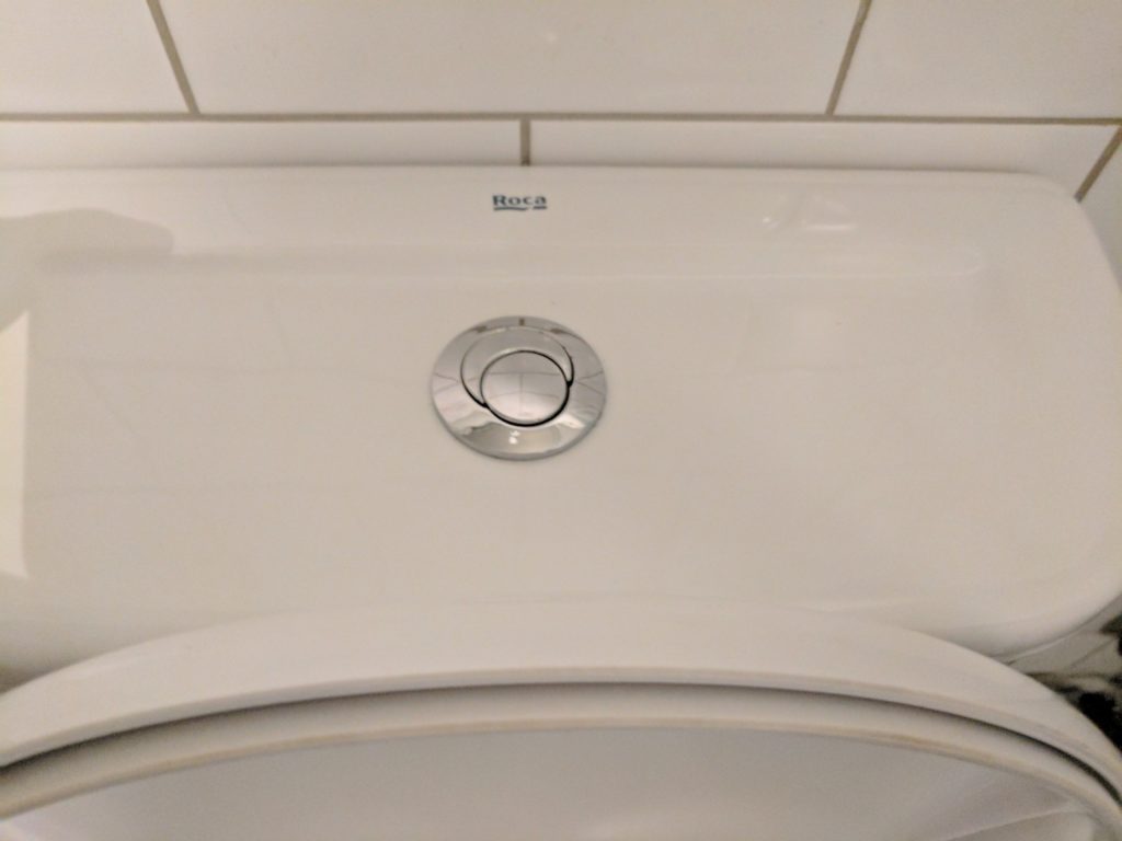
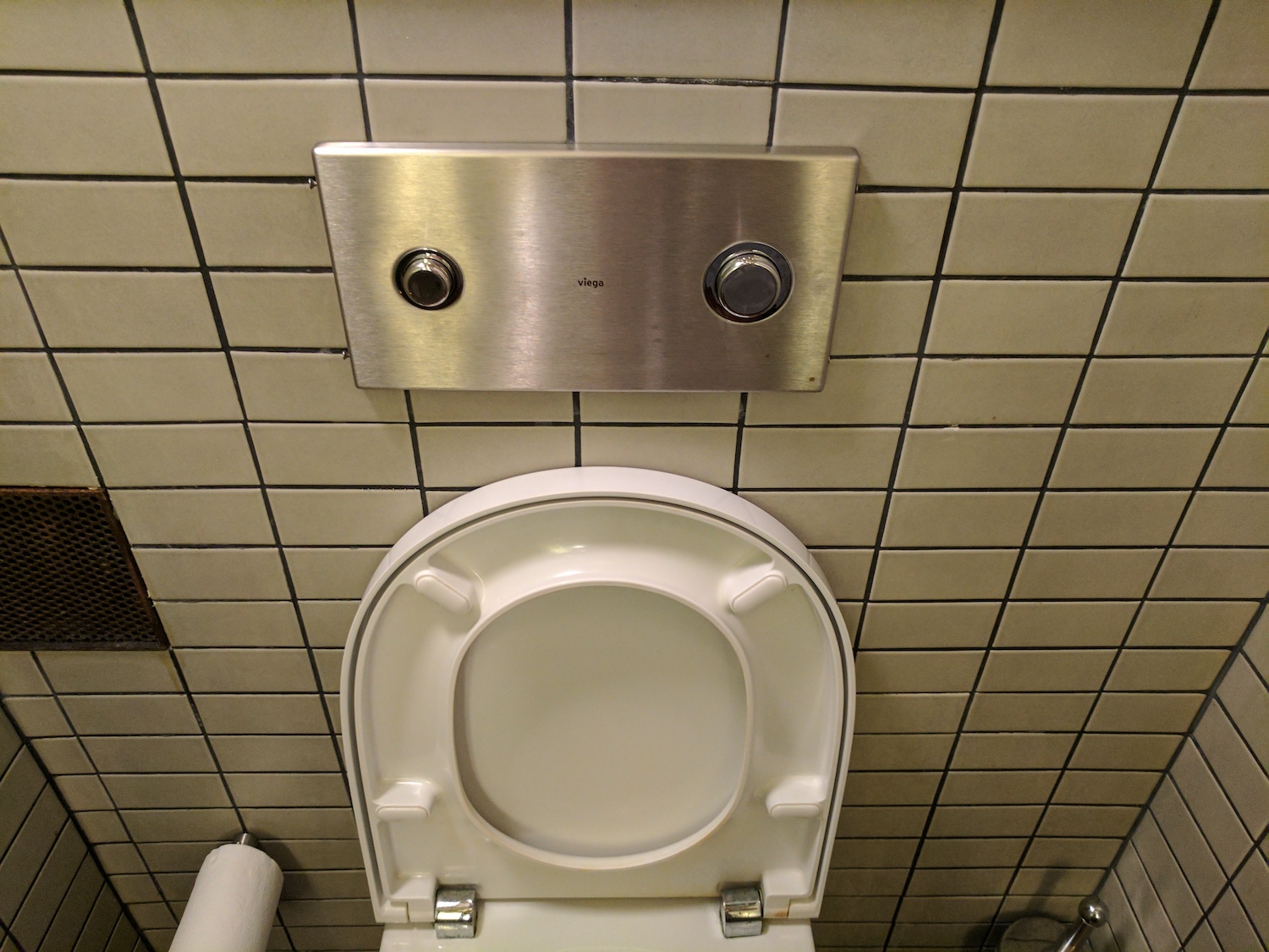
Here, we have handy single and double mark prompts. #1 and #2? Is that universal language? Why is it right to left?
Choose wisely! If you finally figured it out and didn’t end up wasting water at your last bathroom break, this one is totally different!
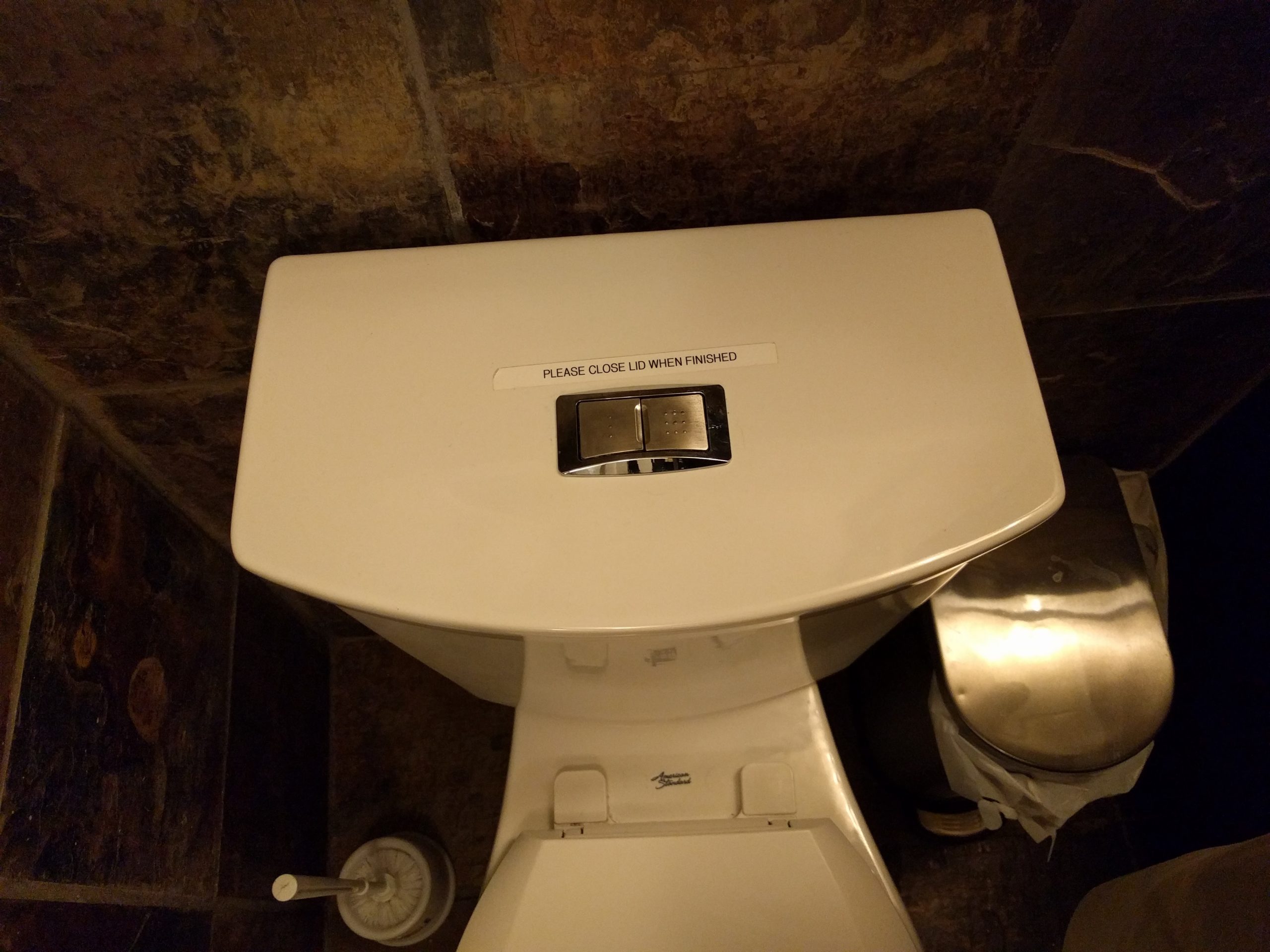
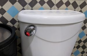 Is this red button only to be pushed in cases of emergency? Sometimes there is a blue one. Is that for liquids, or for more water?
This is the reason that I’m the weirdo that takes photos of toilets around the world. It’s pandemonium. And sadly, the confusion is working against the goals of dual-flush toilets.
I’m guessing the toilet industry doesn’t attract the best interface designers, but if a talented UX pro wanted to step in and save the world from this confusion, they’d be a hero contributing to saving the world.
So, is it just me that finds these confusing? What’s the universal design that gets us out of this mess?
I think I actually understand this one! Wait…